Overtime
The case for a long-term trading range
Good morning,
In the July 3 edition of The Monday Morning Playbook, I laid out a sort of “textbook” scenario for the market that involved a July rally, hitting the skids with seasonal volatility late in the month and into August and September, and the most likely catalyst for volatility being rising interest rates.
We’re not into September yet, but so far that call is working out pretty well, so I want to take today’s Overtime to explore another potential textbook scenario: The long-term trading range.
Now, I believe portfolio positioning should always be based on current trends, and oftentimes investors place too much emphasis on long-term market calls. But I also believe that understanding the environment you are in is of the utmost priority when tactically allocating assets and many investors may not be considering this scenario as a realistic possibility.
So, today we’re going to explore some reasons why a long-term trading could be one of the most likely scenarios for US equity markets including:
Current trends at the sector and small-cap level
Breadth
Previous inflationary-regimes
and macro/cycle analysis
That’s where a lot of the market already is
Most of the market is stuck
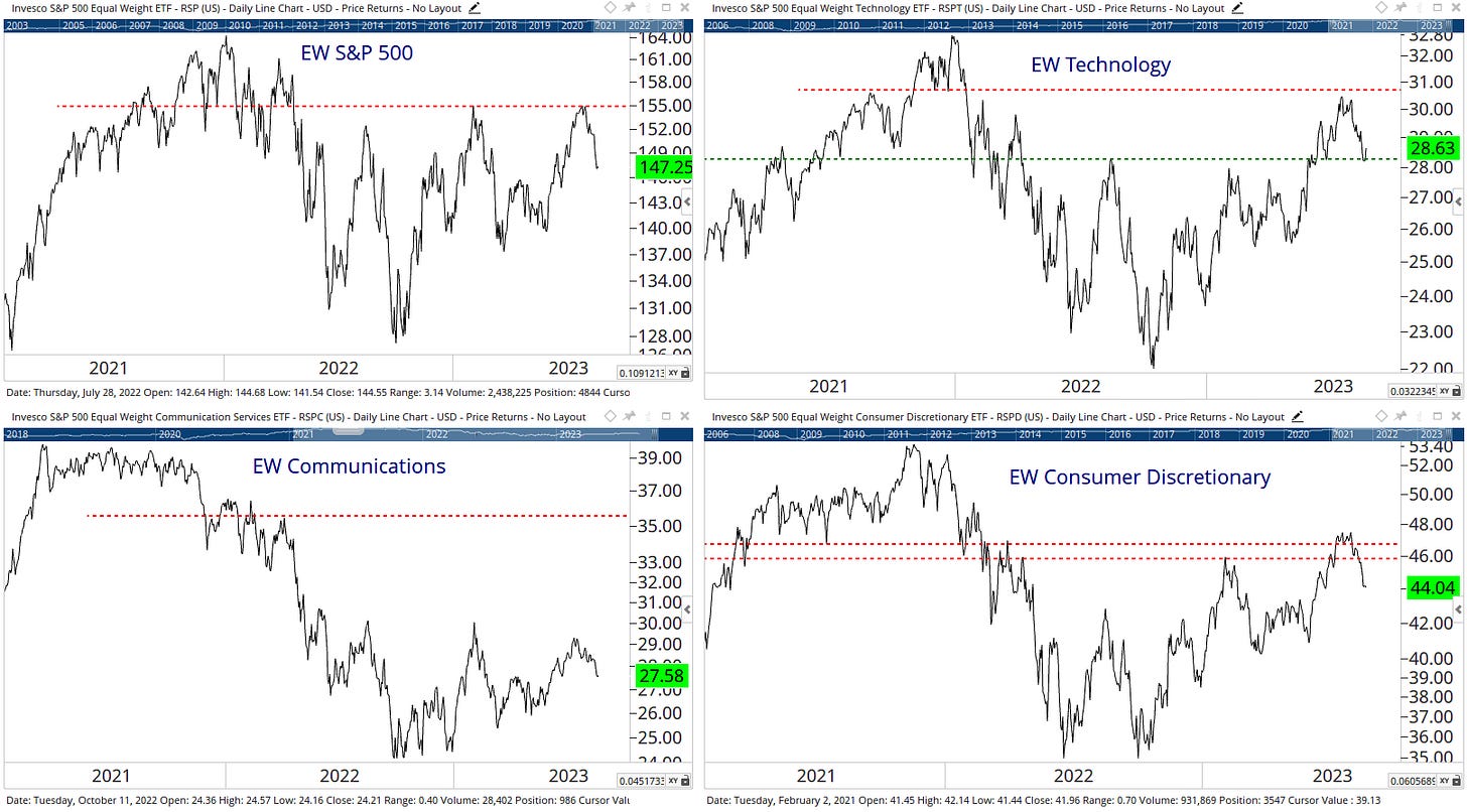
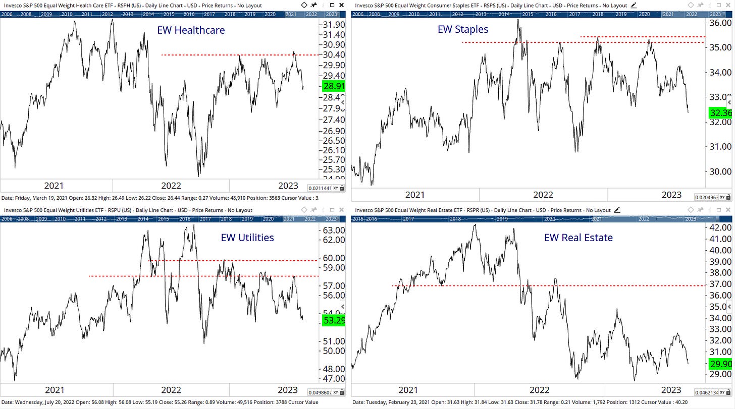
Above are 16 charts covering the equally-weighted S&P 500, all 11 sectors from an equal-weight perspective, and the four corners of the small and mid-cap style boxes. As you can see, even though the S&P 500 is bouncing off its August 2022 highs, only tech, industrials, and energy are in clearly stronger positions than they were in August of last year or February of this year.
Tech failed
The equal-weight charts are supposed to give you a better idea of what the “average” stock looks like in this market. But if we want to just know what the S&P 500 will do, the XLK or cap-weighted tech sector will give us a far better idea. XLK has gotten a huge bounce at the $163 support level the past few days, but until it reclaims $175 we aren’t out of the woods yet and as we explored in yesterday’s Playbook, if opposite style leaders like tech and industrials can’t sustain breakouts, what hope is there for the rest of those middling charts above?
Breadth supports this thesis
NYSE new highs vs. new lows shows a split market
While the S&P 500’s breadth remains in a stronger position, we’ve never seen a full recovery for net new highs on broader measures such as the NYSE and Nasdaq Composite. Both have seen more 52-week lows than 52-week highs over the past week or so, and neither really saw a big surge higher like you would expect 10 months after a bear market low. Overall, this remains a “split” market, with just as many stocks making new lows as new highs. This shouldn’t come as a surprise given those sector and small-cap charts.
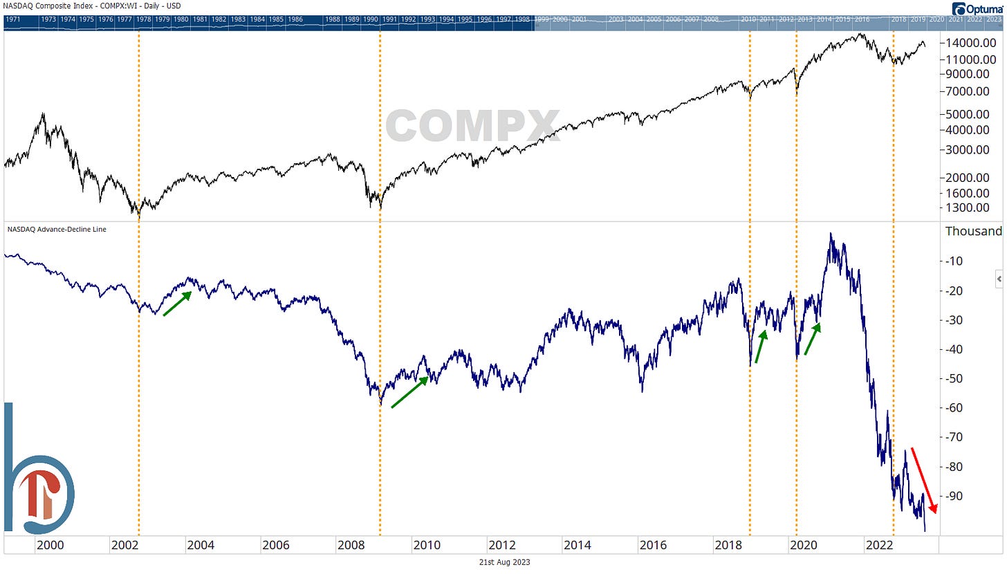
The Nasdaq A/D line should go up at the beginning of a new bull
Here is the Nasdaq advance-decline line, which is one of your local perma-bear’s favorite charts. Why? Because it goes down most of the time. There are a lot of garbage companies in the Nasdaq, and they list and then they go to zero, and that makes this chart look scary.
Buuuut, the only time it does reliably go up is in very strong bull markets, and following major bear market lows. But, here we are 10 months after the bear market low and it is making all-time lows. It does suggest that this market is a combination of either a) not that strong or b) was never really flushed out at the bottom.
Trading ranges have defined inflationary regimes
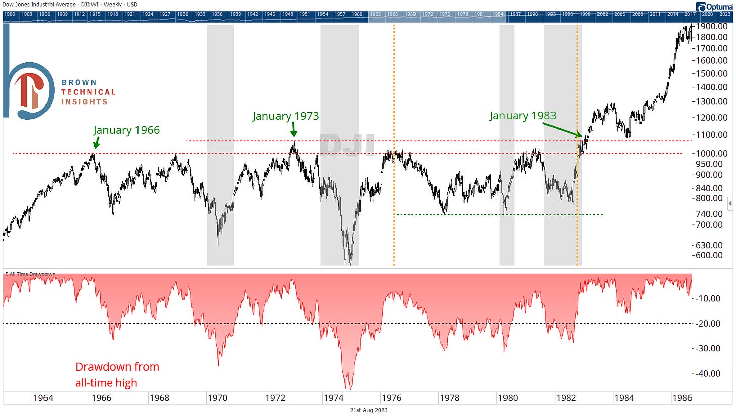
Of course the 1970s
We all think of the 1970s as the preeminent inflationary regime and with good reason. Inflation reached over 10% in both 1974 and 1980 before it was famously brought to its knees by Paul Volcker.
The Dow was just breaking out above its 1966 highs in 1973 when the oil embargo hit. The index proceeded to crash more than 40% and though it initially staged a strong comeback, it didn’t see a new all-time high for a full 10 years. You can also see a smaller trading range emerged from 1976-1981 (orange dashed lines) and I find it notable that even though the first major low there occurred there in 1978, two subsequent recessions still weren’t able to take it below those lows.
But don’t forget about the 40s
The 1940s and early ‘50s were also mired with inflation and saw 3 different spikes of double-digit inflation, including 1942, 1947, and 1951. The time around 1947 is especially striking. The markets boomed through a recession (sound familiar) but then as inflation spiked the Dow fell into a bear market. The index then traded in a vicious 20% range for nearly 3 years but didn’t actually enter a recession until November 1948. And when it did? The Dow tested those initial lows from 1946 but didn’t actually break below them.
Squares up the “macro” bear case
We all know the story. The Fed hikes until they cause a recession and stocks don’t bottom until the recession starts. If this was your playbook last year, you looked like a genius. Unfortunately, that story hasn’t been easy to cling to as the S&P 500 has rallied to 52-week highs.
However, some of those concerns are still valid, even if the timing wasn’t as simple as many had hoped. We still have a yield curve that is deeply inverted and it isn’t even clear the Fed is done hiking.
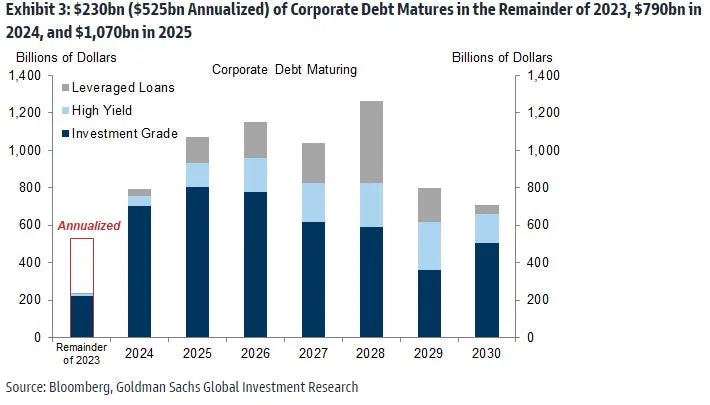
The only way those get fixed without a recession is you have to believe that the Fed preemptively cuts rates by a huge amount, something they probably can’t do without inflation back at 2%. And even if they are done hiking, these rates may be unsustainable. Sure, the consumer has held up strongly, but what about businesses that have to refinance debt over the next few years? That’s the thing about time. 2024 and 2025 are a lot closer than they were a year ago…
Summary
To be clear, I am not advocating for sitting on the sidelines in cash (or worse yet investing in alternative funds) just because we “might” be in a long-term trading range. I’m also not saying we’re going to revisit the lows.
But which strategies we apply and how we allocate assets should always be based on the type of environment we are in, and this isn’t entirely hypothetical. As the first section showed, the overwhelming majority of the US equity market has been rangebound for more than a year.
There will always be big winners and losers at the individual stock level, but as long as this continues, we have to think a little bit differently than we do in strong-trending environments.
To me, that means:
Being more quick to take a profit on the upswing
Being more likely to “buy in” or add to equities the lower we go
Paying special attention to support and resistance (note how well the Dow obeyed simple horizontal lines in both the 40s and 70s)
Focusing more on the absolute chart rather than relative strength because rotation tends to happen quicker
And finally, it can be a great time to gather assets. I know many of you are financial advisors and while it can be frustrating to live through, what followed each of the 1940s and 1970s trading ranges were some of the strongest bull markets in history.
Thanks for reading,
Scott
Scott Brown, CMT
Founder, Brown Technical Insights
Essential insights into market trends, technicals, and opportunities


