The Deep Dive
Morningstar Style Box Review
Large caps versus small? Growth versus value? And what about mid-caps?
If you manage equities by asset class and style, then today is The Deep Dive for you. The original purpose of The Deep Dive was not just to provide charts and context to an important market story (for example, last week’s China focus), but also to go deeper on a theme than The Monday Morning Playbook might allow. And that’s what we’re doing today.
The sell-off in large-cap growth was all the rage last week, but that is in the past. What do the charts say now, and what corner of the Morningstar style box looks most poised for outperformance? Let’s dive in!
Summary: Large growth remains the weakest corner of the style box, and its sheer size in the major indexes mean most other styles or sectors appear to be showing relative strength. Looking closer, it is really the “growth” aspect of portfolios that deserves the most scrutiny, and the charts show that small vs. large trends are primarily being driven by growth leans of the large cap indexes. Finally, I believe that value and small-cap tilts can both add alpha to portfolios, but their relative trends are not inherently bullish for the market, and caution is still warranted for all sizes and styles in absolute terms.
This report will review:
Performance and momentum year-to-date
Relative trends for all 9 size/style boxes
What’s driving outperformance
Macro implications
Responsible position sizing for advisors
Style box returns year-to-date
Large growth stole the headlines last week, but the entire growth style has performed poorly year-to-date. Small cap growth experienced the largest drawdown from its highs (-43% in mid-June) and is still down the most of any style at -35%.
Relative Rotation Graph
The Relative Rotation Graph gives a trend-oriented look at performance and how it is trending more recently. It shows nearly every style in the “leading” or “improving” quadrant except for large growth which is firmly in the lagging box. This makes sense given the immense size of large growth relative to the total market, but is a notable change from earlier in the year when small growth was leading the charge lower.
Breaking down all 9
Below I explore the technical set-up for all 9 squares of the style box. I am using Russell index ETFs for consistency and paying special attention to the relative trend vs. the Russell 3000, which encompasses all the sizes and styles.
Large Blend (IWB): 29% of the Russell 3000
Large cap blend is never going to be able to stray too far from the Russell 3000 in relative terms, and the underperformance you see since May is actually less than 1%. The absolute set-up is nearly identical to the S&P 500 or whichever large blend index you might prefer to use and still in a downtrend.
Large Growth (IWF): 28% of the Russell 3000
Large cap growth has managed to reclaim its summer lows in absolute terms, but is hitting its lowest level relative to the broad market since mid-June. The weakest relative chart of the 9.
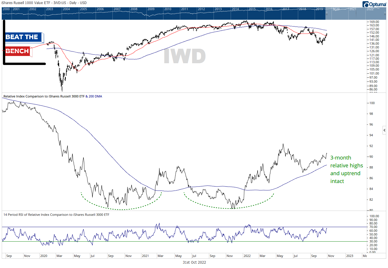
Large Value (IWD): 16% of the Russell 3000
Large value is potentially putting in a multi-year base and breakout here, with the huge double-bottom pattern that goes back to 2020. More tactically, the style is hitting 3-month relative highs and continues to ride an uptrend above a rising 200-dma. The best relative chart of the 9.


